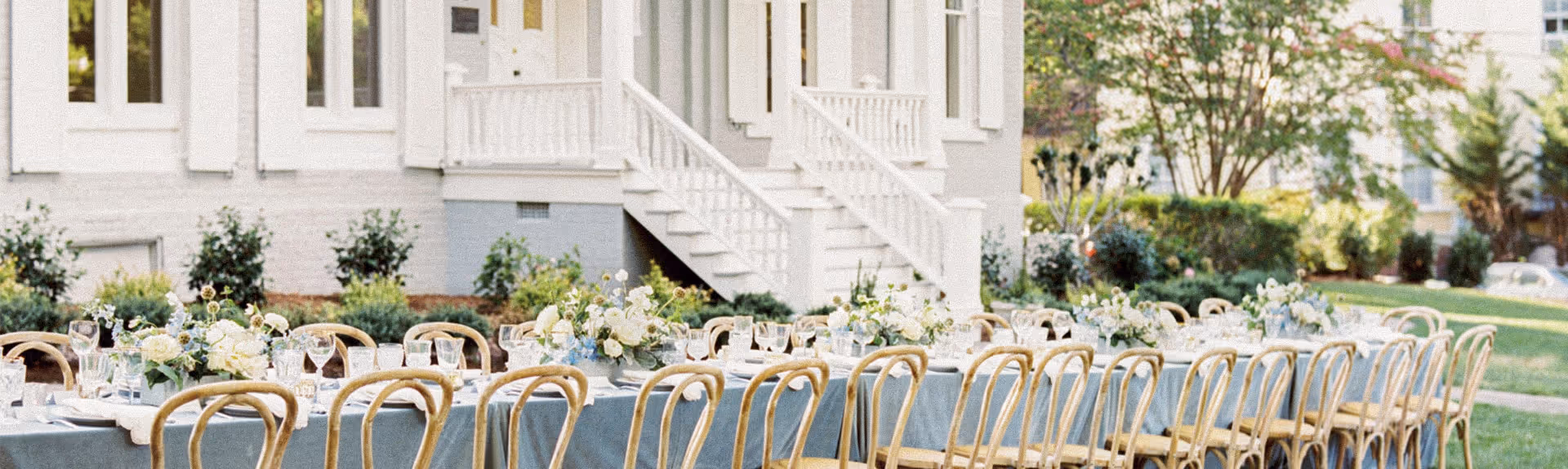
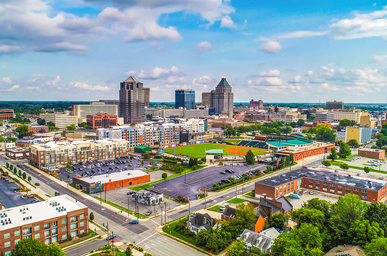
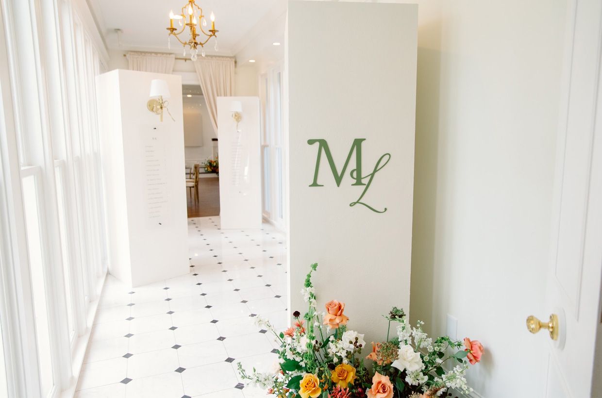
fbpx

Wedding Inspiration: How to Use Bright Color in Your Tabletop Design

We tend to see people shy away from bright colors in their wedding design. It’s not because they don’t love vibrant, fun, rich colors. It’s because they don’t know how to incorporate it in a way that doesn’t feel overwhelming and all-consuming. We’ve had the pleasure of hosting The School of Styling at the McAlister-Leftwich House three times now, and each time we are impressed by the use of color, textures, and patterns. While students may be working with bright and bold colors, they manage to incorporate it into the design in a way that feels seamless and sophisticated.

Today, we’re going to share three ways you can use bright color in your timeless tabletop design!

1. Accent a monochromatic palette with pops of color.

Greensboro, NC Wedding Inspiration | Navy and yellow

Choosing a monochromatic palette lessens the intensity of color, especially when it’s a color that would be considered more neutral like the navy blue above. The navy and white are very clearly the main color palette, but the bright yellow is the showstopper. What would have been a very classic and beautiful design was made a bit more playful and memorable with the yellow accents.


2. Make one thing colorful.

Blush Pink Wedding Color | Greensboro, NC Venue

Maybe you’re not ready to commit to tons of color, so why not just make one thing colorful? This design is neutral and classic, but the pink velvet linen really makes it memorable. If the designer had chosen a white or ivory linen this tabletop wouldn’t have made a lasting impact, but with the rich and creamy tones in the blush (not to mention the fact that velvet is a very sophisticated textile), this feminine design is one that guests will be talking about!


3. Utilize contrast when choosing your color palette. 

North Carolina Venue | Navy Wedding

A contrasting color palette makes a statement, but when paired with key neutral elements like the linen, china, and flatware, it doesn’t feel harsh or overwhelming. The blue glassware, gray napkin, black candles, and pops of copper roses feel elevated and thoughtful. If you’re too afraid to commit to a dark shade you love, pair it with lighter tones and a neutral base!

Moral of the story: you do not need to fear color! There are easy ways you can add colorful touches into your classic and timeless design as shown above. What’s most important is that the design feels like you. And if you have trouble figuring out just what you love, we highly recommend hiring a wedding planner/stylist (more on this here).

Tell us, what colors did you choose for your wedding palette? What led to your decision: season, venue, or trends?


How to use bright colors in your tabletop design. North Carolina wedding venue, McAlister-Leftwich House

Photography by Shalyn Nelson

Leave a Reply

Your email address will not be published. Required fields are marked *